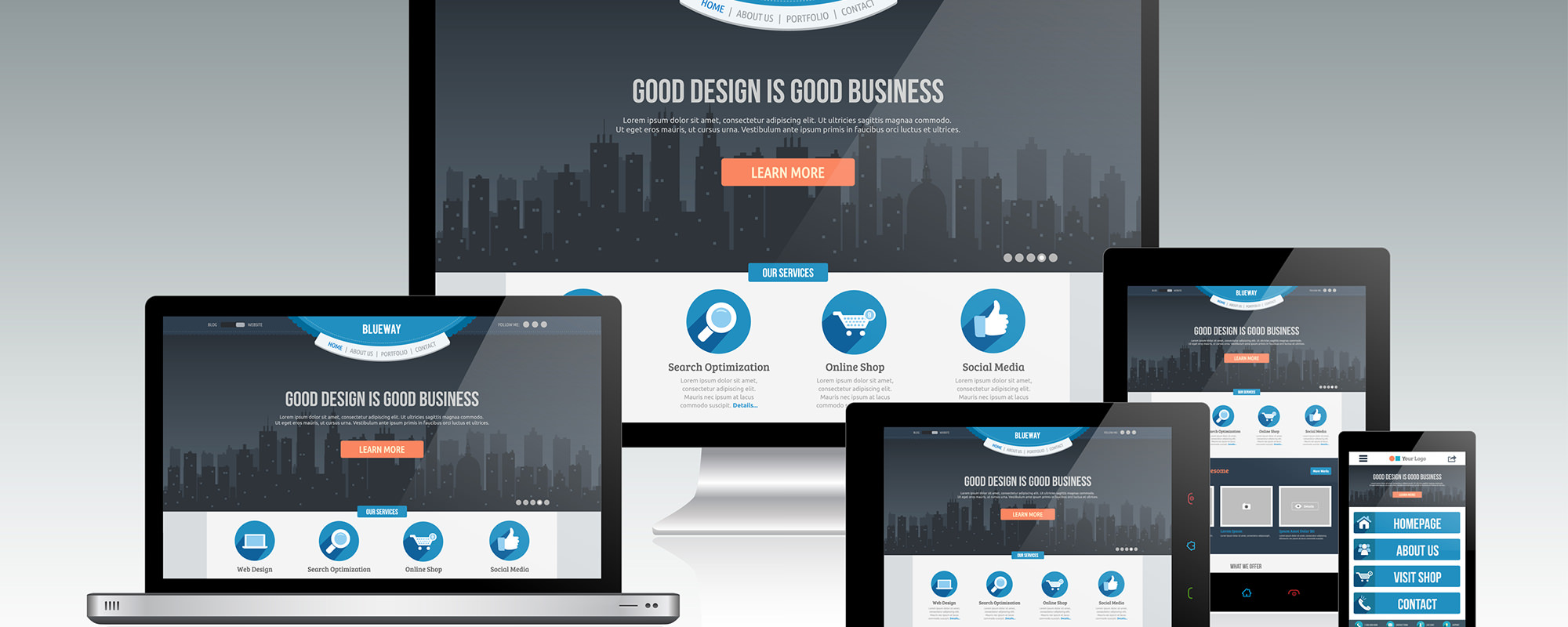
How do people get to your website? People use everything from:
- Desktops
- Laptops
- Tablets
- Smartphones
- TV’s
- and who knows what’s next.
That is why you need a website that is responsive to the device. I don’t mean a standard website and a mobile site. I mean One website that is fluid. This is actually what Google and other search engines prefer. It is also much easier to maintain since there is only one code base.
You and I don’t know what the next mobile connected device is going to be. Watches are now connected to the internet. Refrigerators are now connected to the internet. So you need a website that uses whats called Media Queries combined with the power of CSS3, HTML5 Markup and the cutting edge technologies that power enterprise level websites but at a down to earth price.
Have you ever visited a website that isn’t responsive? You can tell if the text is to hard to read on an smart phone or if the layout is scrunched to fit on your small screen. This ends up being a poor solution for your website visitors and will ultimately lead to lower conversion rates.
If you want Higher Conversion Rates then it’s time to go with a Responsive WordPress Theme or Website and that’s what we at PixemWeb are experts at.
